


Commercial photography is the genre within our business that most often means you are photographing someone or something for the purpose of selling the product or person or disseminating information about it/them! As I have often said, if you are shooting for a publication, you need first to know the publication, how it uses images and what types of images it needs. When I go on assignment for any publication, and I know who the subject is and what they do, I most always have a picture in mind of what I want the final image to look like.
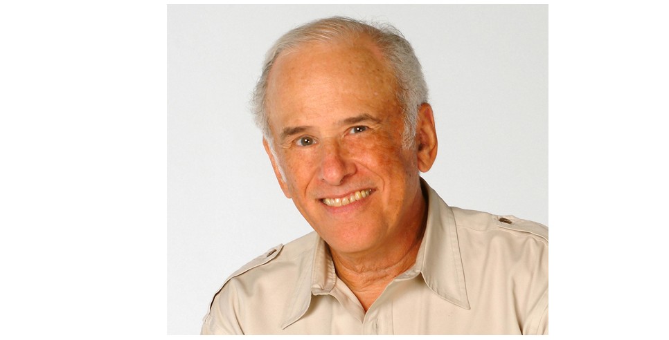
This was the case this week when I was assigned to make some portraits of the famed art director George Lois. Mr. Lois was most noted for his work as the art director for ESQUIRE MAGAZINE, back in the 1960s, '70s and '80s. I was familiar with a great deal of his work and even though I had shot an assignment for the magazine, I had never worked for him. Knowing something about his body of work, I decided that the shot I was after was of Mr. Lois presiding over a few of his famous Esquire covers. I had no idea about what his apartment looked like, but I thought that he must have a table on which I could display his work and have him sit behind them.
When I got to his apartment, I had to take off my shoes and I quickly got the impression that much of his furnishings were precious (some designed by famous artists), and that I couldn't just use any table he had. The one table that I could use was in a small dining area. It was made of black glass and had a beautiful Tiffany lamp that descended quite low over it. I began thinking that it would be hard to light his face because the Tiffany lamp would either be in the way or create some funny shadows on Mr. Lois' face. Since it was the only table I could use, I decided to place my mainlight off to one side. I began making some exposures and noticed that the shadows on the opposite side of his face were interesting, but probably too dark for a magazine cover. So, I set up a fill-light on the other side. I wanted to create an interesting lighting on Mr. Lois' face, but I wanted it to be informative as well. (This was for a cover, after all). I dialed the power down on the fill-in light until it was about two-stops less than the mainlight. This provided enough information but still kept the integrity of the shadows.
Here's what the initial setup looked like:
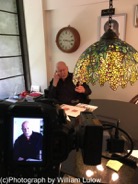
You can see how I had to avoid the Tiffany lamp.
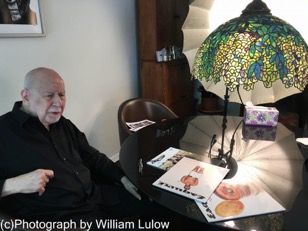
Here is the placement of my mainlight. You can see how it was positioned behind the Tiffany lamp:
I had also decided that I wanted Mr. Lois to be in Black & White and all his famous magazine covers to be in color. My thinking was to create a really dynamic looking B&W portrait, but yet have some focus on the covers as well. These days, most magazine covers are in color, so a B&W cover tends to attract a bit more attention! All this, in order to create an interesting cover that would make people want to read the article! These are some of the tricks you can accomplish in post-processing with Photoshop! Here is the one I think will be great for the cover:
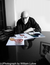
In addition to the color effect, note that the Tiffany lamp was removed along with some distracting background material. This gives my magazine's art director room to put the title as well as some copy on a plain background, yet still shows an intense portrait of my famous subject. The reflection in the table was an extra, added bonus!
William Lulow
William Lulow is a commercial portrait and corporate photographer in the Greater New York Area. His clients include IBM, Swiss Re, Westchester Magazine and Michael Baker International (Engineering), among many others. William is also a certified teacher of photography having been an adjunct professor at New York's New School For Social Research. He publishes daily blog articles on photography. His goal is to raise people's awareness of photographic principles in order to better their photographic efforts.